Tuesday, October 28, 2008

graphic design portfolio

I've been thinking about the layout of my site for internet authoring and have researched various layouts etc. I came across one guys portfolio which i really like. All the page is simple black and white, and I think the main welcoming image is really soft and subtle.


It would be nicer is he had tabs to navigate instead of scrolling all the way down but i like the simple typeface he's chosen and choice of colours for the site.

He's made websites for big names like Sony and Woman's Health.

He has lovely poster designs too.

Olivier Heitz

Monday, October 20, 2008

Adgoodness!

Came across this pretty cool site.

frederiksamuel

Lots of great images and links on it.
I really like these lego images, very clever design! ah lego! brings me bring back to my youth! :P


something else i found on the site was comparison of hp's old logo and new logo.

This is one guy's opinion on it :

"HP has decided to join the glossy button bandwagon, and now the logo almost looks like a SUPERHERO!! (I don’t mean that in a good way though) They have decided to move away from the rounded rectangle and go with a circle. The HP now has a “fancy” bevel to it as well. For some reason i also see the word NO in the new logo now. Overall I don’t think this is an improvement from their previous well recognized logo."


What are your thoughts?

I myself prefer the original logo. I agree the "superhero" bevel effect is overdone on alot of logos!

Wednesday, October 15, 2008

New Apple Macbooks

Apple have launched there new series of laptops boasting
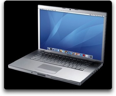
all new special features, i.e. upgraded NVIDIA GeForce graphic cards on their 13 inch macbooks to 9400 M GTand 15 inch macbook pro. However on the 17-inch Macbook pro model they've kept the original 8600M GT card. They've designed the 15 inch macbook pro to look the same as the 13th inch macbook. Why? The 17 inch macbook pro is the only model to maintain it's original look. Although Apple have some nice new features such as the multi-track touchpad which has no button because it acts as a button itself. I still don't like the look of the new machines. The sleek look of the pure aluminum was much nicer to my eyes!


It makes me think do computers/ mp3 players change their designs all too soon
to keep up with "fashion"?

Here's the old 15inch model :


Here's the new one:

Sunday, October 12, 2008

flickr 365

the 365 group was created on flickr to enhance individuals photography skills. the idea is to take a photo of yourself or every day objects in your life every day. that is 1 photo every day for a year. to see how much you can challenge yourself and think
creatively.

here are my photos so far :

my flickr 365

for more of my photos :

click here! :)

Monday, October 6, 2008

What are the most important social networking websites?

MySpace.com: 191 million members. This site is massive, boasting the largest membership of any social networking site on the Internet.

Facebook.com: Was initially intended for college students -- it branched out, and now allows everyone membership. 70 million members.

Linkedin.com: 12.5 million members -- a powerful tool for business networking.

Friendster.com: 29 million members. Friendster was considered the top online social networking service until around April 2004, when it was overtaken by MySpace. Demographic studies indicate users are from 17 to 30 years old.

Stumbleupon.com: Boasting 2.75 million users, StumbleUpon is a web browser plugin that allows its users to discover and rate webpages, photos, videos, and news articles. A great way to get website promotion. Bought by eBay for $75 million in May 2007.

del.icio.us: The website del.icio.us (pronounced as "delicious") is a social bookmarking web service for storing, sharing, and discovering web bookmarks. The site was founded by Joshua Schachter in late 2003, and is now part of Yahoo!.


Thursday, October 2, 2008

flickr

http://www.flickr.com

a great place for soucring photographs and design!