frederiksamuel
Lots of great images and links on it.
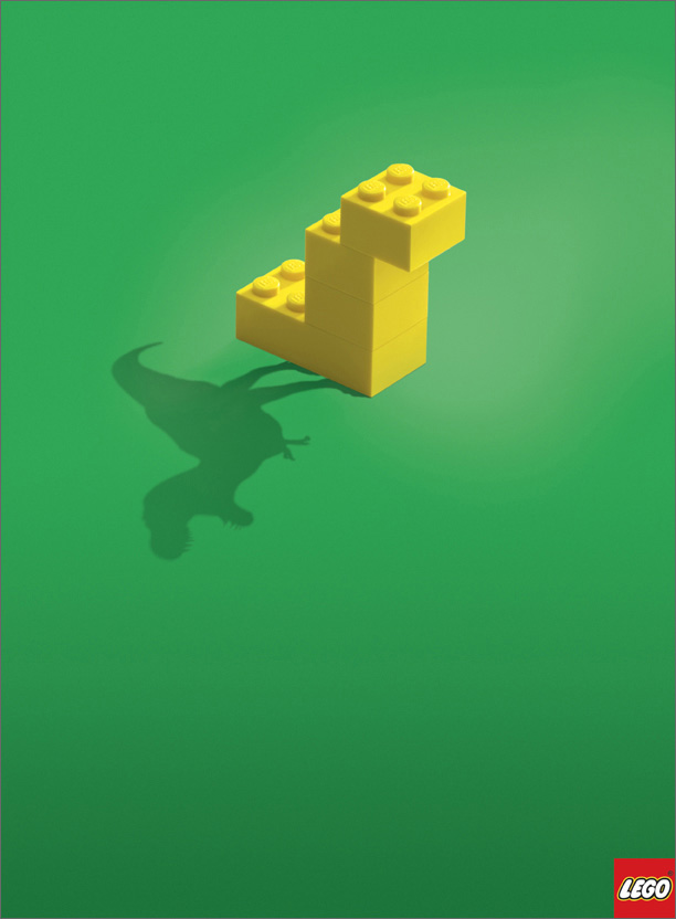
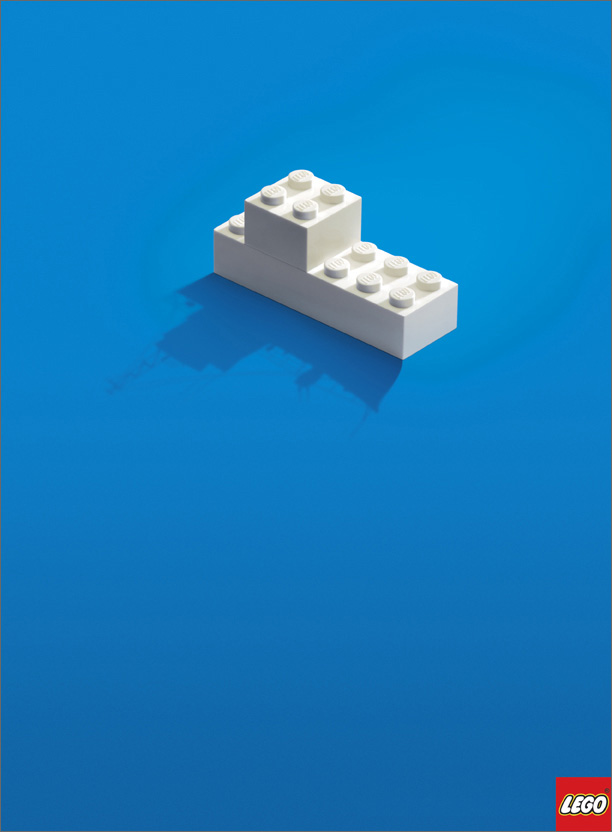
I really like these lego images, very clever design! ah lego! brings me bring back to my youth! :P
 |  |
something else i found on the site was comparison of hp's old logo and new logo.

This is one guy's opinion on it :
"HP has decided to join the glossy button bandwagon, and now the logo almost looks like a SUPERHERO!! (I don’t mean that in a good way though) They have decided to move away from the rounded rectangle and go with a circle. The HP now has a “fancy” bevel to it as well. For some reason i also see the word NO in the new logo now. Overall I don’t think this is an improvement from their previous well recognized logo."
What are your thoughts?
I myself prefer the original logo. I agree the "superhero" bevel effect is overdone on alot of logos!

3 comments:
I also prefer the old HP logo. Initially I thought the new one was pretty but really there was no need for it.
In my opinion a logo should be simple & clean. I think its important that it can be reproduced in just black and white successfully. I find its usually the simplest things are the most beautiful.
Why complicate it?
Niall
ps Lego is cool and I love those pictures. Its like a window into a childs imagination!
I have a love/hate relationship with the old shiny glass web2.0 look.... sometimes i love it..sometimes it just seems over done...
Post a Comment